Interior design professionals and their clients are increasingly conscious of their carbon footprints as well as creating dramatic design statements, which is why retaining existing elements and adding in new features is perfectly on trend.
by Helen Parton
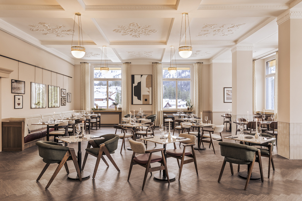
Faern Arosa Altein is designed as a sociable haven for hotel guests returning from a busy day on the mountain.
© Romain Ricard
Today’s interiors are often a wealth of old meets new with a seamless blend of restored features and contemporary design. Take Faern Arosa Altein for instance. This Swiss hotel embodies this idea of a historical building which has been given a modern-day makeover. This contemporary ski hotel has been transformed by Run For The Hills which restored the entrance lobby, concierge desk and breakfast buffet, and designed all its bars, restaurants, common areas and breakout spaces. The contemporary alpine interiors feature tactile upholstery, sheepskins and cosy woollen armchairs while mesh panels, ribbed glass column lights and brass fittings give an urban-inspired edge. From the Wes-Anderson inspired wooden reception desk onwards, the interior elevates the hotel’s heritage and location to form its next chapter with a colour palette ranging from forest greens to burnt rusts, and golden sun ochres, which is warmed with characterful timber furniture, tailored joinery and terrazzo topped tables.
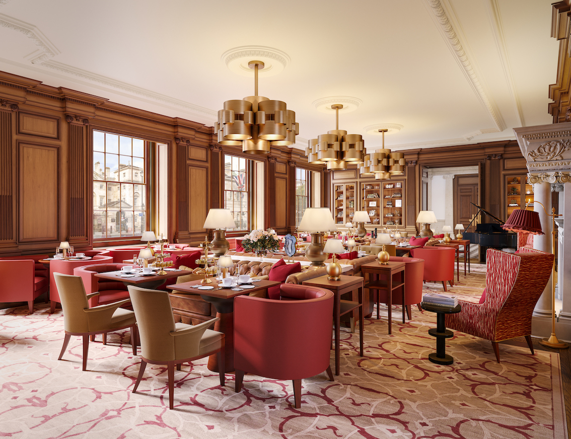
The OWO unlocks a staggering piece of British history to enhance London’s contemporary hotel scene with contemporary patterns and fixtures that enhance the building’s history.
© EPR Architects / Raffles London / The Office of Thierry Despont
Raffles Hotel at the OWO emerged last summer as a formidable presence in London's Whitehall, transforming the iconic Old War Office into a haven of modern-day luxury and sophistication. With roots dating back to 1906, this historic building boasts a rich tapestry of royal and political history. The site comprises 120 hotel rooms plus nine restaurants, three bars, and a destination spa and health club, including a 20 metre pool as well as 85 private branded residences. EPR Architects carried out the renovations which saw new floors and basement levels added, seamlessly blending modern amenities with timeless charm, while the late Thierry Despont was responsible for the interior. Customised carpets, fabrics, and wallcoverings evoke a sense of timeless elegance, while bespoke furniture adds a touch of sophistication.
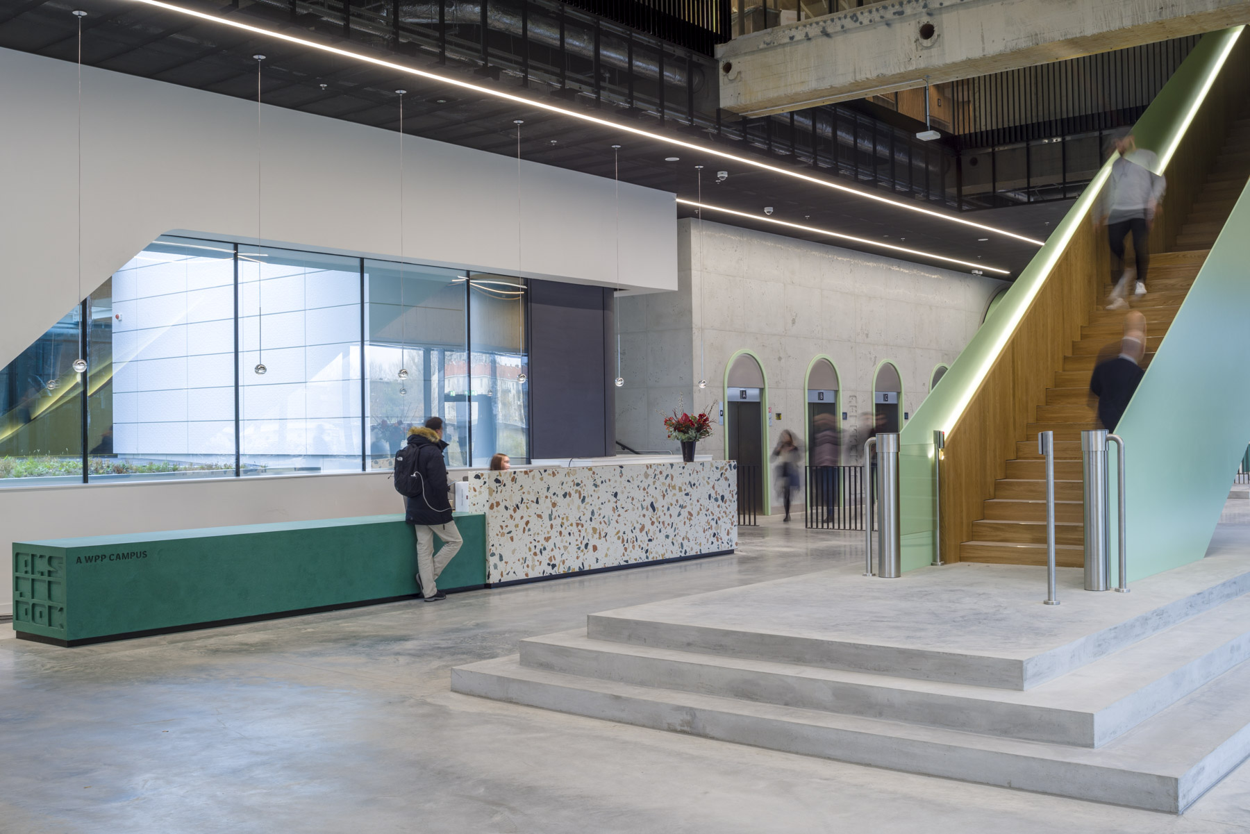
This large-scale structure, resembling stacked boxes now provides spaces to encourage face-to-face interactions.
© Gareth Gardener
Over in Amsterdam, BDG architecture and design created a campus building for creative transformation company WPP in what was an unloved 1970s Modernist building. It’s now a destination for innovation, enabling 1500 employees to come together. Materials-wise, reflecting the need to be open and transparent, white mosaic tiles were replaced with glass allowing more natural light in. The reception and lobby is an impressive eight metres high and provides a dramatic welcome for visitors and staff. The dramatic staircase reinforces the feeling of connection. Levels one and two provide a plethora of meeting space separated by glazed or solid partitions while exposed concrete flooring and services complete the contemporary look. More outside space was offered by landscaping the roofs at varying height to provide yet more social settings.
In the capital of the Costa Brava, Girona, design studio El Equipo Creativo has completed the interior design of Palau Fugit. This disused 18th century palace was transformed into a charmingly contemporary destination. El Equipo Creativo used two sides to Girona, its the Barri Vell or old town with its weathered stone facades, hidden cul-de-sacs, porticoes and stone ramparts and then colourful elements of the townhouses which can be found along the River Onyar which feature modern art and crafted objects. These two principal parts have been adapted to a modern hospitality environment by Barcelona-based architecture studio Isern Associats.
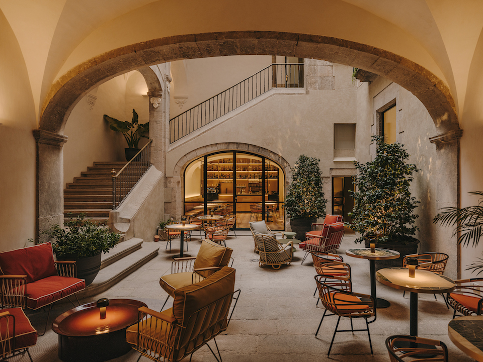
An arched courtyard, renamed ‘La Placeta’, is where the reception area, restaurant and cocktail bar are, reached via the original staircase of the palace.
© Salva Lopez
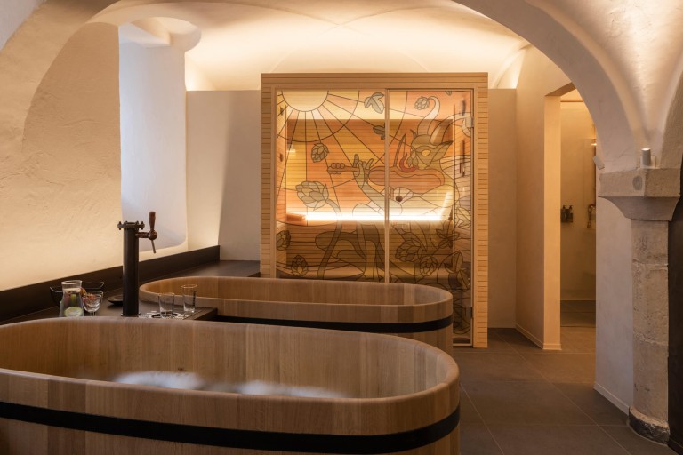
Designers WeWantMore taps into beer, bathing and Belgium’s beer heritage in the design of a contemporary spa.
© WeWantMore
Belgium based award winning design studio WeWantMore was behind the interior design, branding and even the name of the Bath & Barley spa located in a beautiful vaulted cellar in the centre of Brussels. Inspired by Belgian’s beer heritage the material palette include a curved copper installation inspired by ancient copper kettles with dried barley and hops hanging from the ceiling and stained glass. Exposed walls, raw concrete and blue stone complete the earthy feel of the ground floor.
Whether historical building or twentieth century structure in need of a makeover, insightful design can cleverly unite old and new.